Freddie's Flowers Campaigns

Intro
Freddie's runs a back-to-back seasonal campaign calendar – Christmas, Valentine's Day, Mother's Day, Peony season – with little room between launches. I introduced new processes and a modular email design system to keep the output consistent under that pace, which meant campaigns hit deadline reliably and freed me up to focus on creative direction rather than production.
Deliverables:
Branding
Brand Strategy
Art Direction
Illustration
Brand Systems
Email Design
Print Design
Retouching


Peonies are the divas of the flower world and one of the most important seasons in the flower calendar – stunning, but short-lived. The campaign needed to drive pre-orders while communicating flower care. Drawing on previous years' experience, we knew simplicity was the best way to let the flower speak for itself, paired with blurred imagery to reference the fleeting nature of the bloom.


Mother's Day is one of the biggest trading periods, and a new product launch with candles alongside the flowers. As a predominantly subscription business, we needed to clearly communicate the option to buy one-off gifts and appeal to customers who might shop at M&S or Bloom & Wild. We took an emotional approach – playing on the idea of nostalgic snapshots through layered imagery, which also gave us a way to feature a variety of images without sacrificing space or clarity.


Valentine's Day was a relatively new trading period for Freddie's Flowers, so the approach was a softer tug on the emotions rather than anything overtly romantic. Hand-drawn illustrations and handwritten notes, the kind you might leave on a post-it or the back of an envelope, sat alongside a deep red colour palette and beautiful photography. This allowed us to land multiple marketing messages without being heavy-handed.
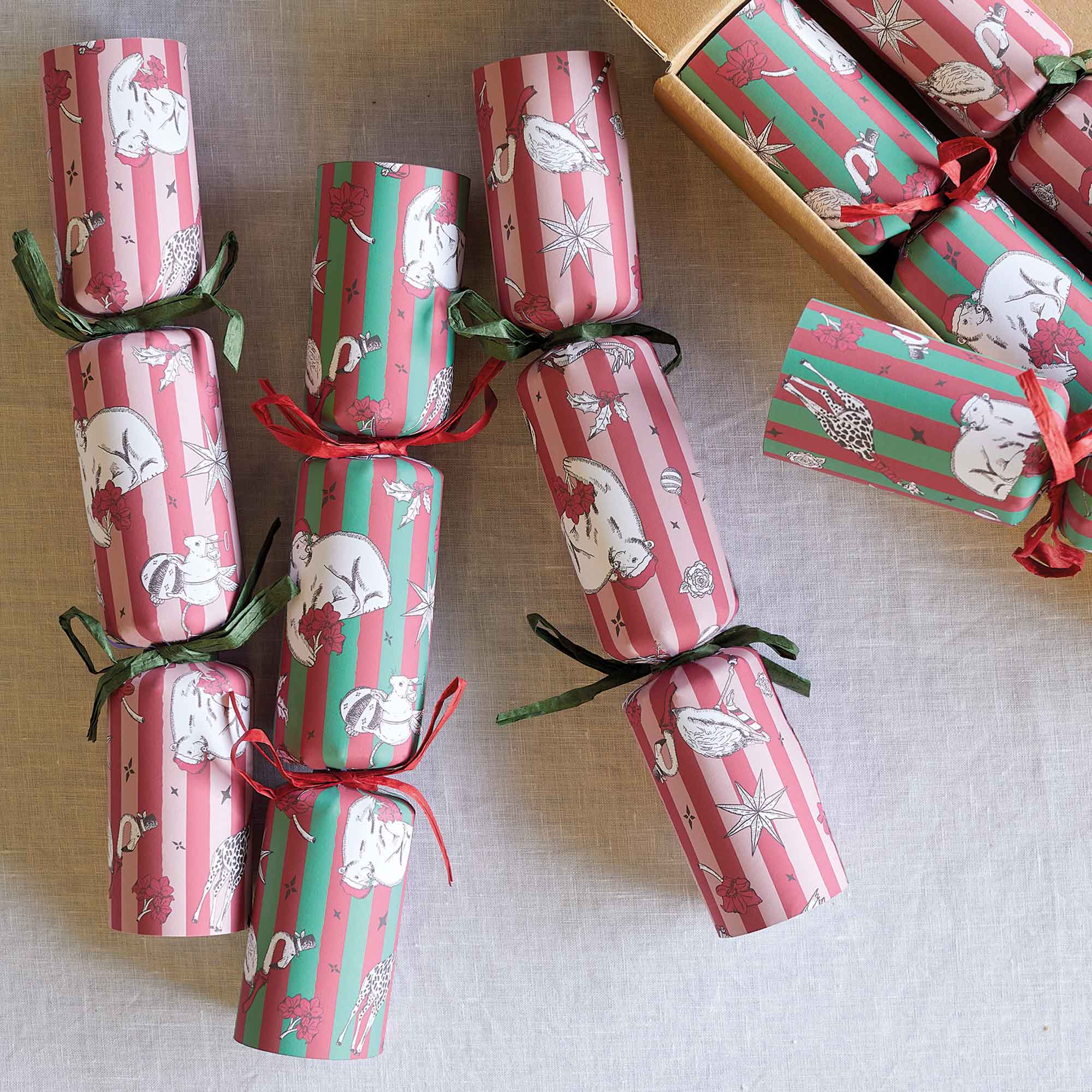


Christmas brought a large product launch alongside complex information that needed to be communicated about ordering deadlines and delivery windows. To sustain interest across a long campaign period and stay true to the brand's fun, light-hearted character, I developed a suite of Victoriana-style illustrations that could flex across every touchpoint.
